Australian Frequent Flyer Has a Fresh New Look & Feel
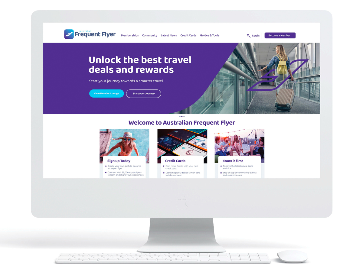
You might have noticed that Australian Frequent Flyer (AFF) has a brand new look!
We’ve updated our logo and refreshed our website to bring it into the modern era – and it was about time. As much as some people liked the “old school” look of the old AFF, I’m sure most people will agree that the rebranded AFF looks more modern and inviting – especially to younger travellers. The new AFF website is easier to navigate and more inclusive.
The way you navigate the AFF community forum hasn’t changed, but you will notice that the colours and font have been refreshed in line with AFF’s new brand identity.
Our team has done a great job of updating the website. Nonetheless, with any major change, it’s possible that there may be some teething issues. Over the coming days and weeks, you may notice some things that don’t work quite as expected. We’re working hard to iron out any bugs quickly, but please let us know if you see something on the new website that doesn’t work or isn’t quite right.
What’s changed
The AFF rebrand involves two main changes:
- A new visual identity, including a new logo, colours (midnight purple and sky blue), font and branding across both our website and social media channels
- A new user experience when viewing AFF’s home page, articles and navigating the part of the website that houses our editorial content.
The completely new home page and website is fast and built to last. It’s designed to make it easier for both experienced community members and people discovering AFF for the first time to find what they’re looking for. It’s also better optimised for viewing AFF on mobile devices.
Over time, we’ll add more new, useful tools to our website. These will help us to continue our mission of turning everyday travellers into expert frequent flyers, through shared wisdom and tools.
With this change, we also want to add a renewed focus on bringing AFF members together – both digitally and face-to-face.
The new website makes it easier for members to learn about upcoming social gatherings and events. We plan to back this up with more in-person events for AFF members, including our new MasterClass concept where members can meet for a day of learning and networking.
What’s not changing
The AFF community remains at the heart of everything we do. Without our wonderful community, AFF wouldn’t exist. If you’re reading this, that includes you!
AFF remains the largest and most active frequent flyer community in Australia. Although the website was bought by Point Hacks three years ago, AFF is not Point Hacks and isn’t trying to be.
We believe that having a strong, unbiased opinion is important. We’re here to keep the community accurately informed, to make it easy for Australians to find the best advice, guides and deals, and to advocate for the interests of travellers. And we’re doubling down on our commitment to integrity and to the trust that the community has placed in AFF.
This rebrand solidifies AFF’s position as the go-to destination for frequent flyer mastery. You’ll continue to enjoy the same trusted content and newsletters that you’ve come to enjoy and trust for many years – now in a more intuitive format.
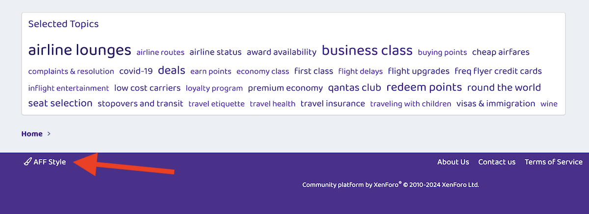
How to keep the forum’s old appearance
While the home page has changed, and our forum has a new look, the way you navigate between forum pages hasn’t changed. The forum rebrand is purely cosmetic.
If you prefer the old forum appearance, you do have the option of continuing browsing AFF in the old style. To do this, go the forum and scroll down to the bottom of the page. On the right-hand side of the page footer, you can click “AFF Style”:
Then, select “AFF Classic Style”:
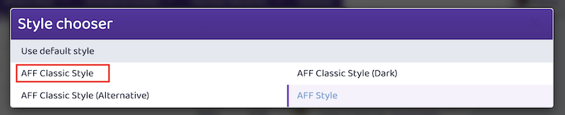
When you’re logged in, you’ll then continue to view AFF using the old appearance.
Please note that, while the old style will continue to work for some time, it will no longer be maintained with future updates.
We hope you’ll love these changes!
We understand that the new look and feel of AFF might take a bit of time to get used to, but we hope you’ll like it. If you do have feedback or suggestions, please share them with us.
Thank you for being a part of the AFF community!


Community Comments
Loading new replies...
Join the full discussion at the Australian Frequent Flyer →