You are using an out of date browser. It may not display this or other websites correctly.
You should upgrade or use an alternative browser.
You should upgrade or use an alternative browser.
New QF livery and logo
- Thread starter boomy
- Start date
- Status
- Not open for further replies.
tomlee1986
Established Member
- Joined
- Feb 27, 2014
- Posts
- 2,187
- Qantas
- Bronze
- Virgin
- Red
I prefer the old type face.. looks better
- Joined
- Nov 12, 2012
- Posts
- 32,007
- Qantas
- Platinum
- Virgin
- Gold
- Star Alliance
- Gold
The new typeface doesn't seem to fit the brand. It feels very Corporate America circa the new millennium. Irrespective, are some benefits from an application use to having a thinner weight font, eg it can now be applied much larger on the planes.
Outside of that, does anyone else feel this brand launch was entirely underdone? A rebrand should be lead by a reasoning and positioning, and then deserves an event of its own, not just covering on an a330 pretending to be a dreamliner. The fact they just finished painting the fleet of a330s in old livery suggests it wasn't a long term plan. Other brand assets can be much more readily updated in a timely fashion, planes don't get repainted for years.
I'm definitely not one to bash QF for the sake of it but after working in this field for almost 10 years and in fact being interested in joining the brand team a year ago I cant help but feel a little disappointed for a brand I love.
Read our AFF credit card guides and start earning more points now.
AFF Supporters can remove this and all advertisements
dasheighty
Intern
- Joined
- Jun 12, 2012
- Posts
- 72
Don't like the new typeface. Looks like someone has been playing in the MS word font library.
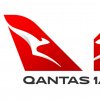
I also notice QF have now been able to "enhance" the 'roo on the tail. Enhanced to the point of removing the front legs!
Would have thought they might have launched their new plane with a Wanula dreaming like design. Could have even called it the DreamTimeLiner. Apologies if this has been used before.
- Joined
- Nov 16, 2004
- Posts
- 49,493
- Qantas
- Platinum
- Virgin
- Platinum
- Oneworld
- Emerald
I have seen photos hopped pictures doing the rounds of a kangaroo with no arms ... :shock: 
moa999
Enthusiast
- Joined
- Jun 23, 2003
- Posts
- 13,945
The fact they just finished painting the fleet of a330s in old livery suggests it wasn't a long term plan. .
They hadn't finished. QPG and QPI are still old Roo, as are a bunch of 737s...
Interesting that Joyce has said all will be repainted by 2020.. whereas with the most recent logo they didn't paint everything in eight years
pauly7
Senior Member
- Joined
- Dec 8, 2004
- Posts
- 5,447
I like the new flying kangaroo but not sure about the new typeface, especially the Q which looks far too round and more like an o.
I love the new roo very sleek and modern.
Typeface is growing on me - but a big change. More I look at it the more I like it.
Fabian Stirling
Newbie
- Joined
- Nov 22, 2010
- Posts
- 1
- Qantas
- Platinum
The new look looks OK but I am not a fan of the kangaroo having it's front paws amputated. It looks less like a roo and more like a 3 armed boomerang
- Joined
- Nov 16, 2004
- Posts
- 49,493
- Qantas
- Platinum
- Virgin
- Platinum
- Oneworld
- Emerald
gaz0303
Active Member
- Joined
- May 22, 2011
- Posts
- 673
- Qantas
- Platinum
- Virgin
- Platinum
- Oneworld
- Emerald
- Star Alliance
- Gold
I really like it, especially the font. Very contemporary and clean. Well done
plus one...
PineappleSkip
Established Member
- Joined
- Mar 30, 2007
- Posts
- 3,390
- Qantas
- Platinum
- Virgin
- Red
The new font.  I hate it.
  Hate it.
  Hate it. I'm sure I read a blurb that claimed it was slimmer. Looks fatter! Presumably the washed out colour indicates how Qantas is wishy washy these days.
And as for the new thalidomide victim kangaroo, OMG. It's been enhanced!
 First they chopped off its wings, now its paws. Does the removal of limbs symbolise cuts to staff, routes, platinum benefits or what?
Did I mention that I hate the new font yet?
Cheers skip
And as for the new thalidomide victim kangaroo, OMG. It's been enhanced!
Did I mention that I hate the new font yet?
Cheers skip
- Status
- Not open for further replies.
Become an AFF member!
Join Australian Frequent Flyer (AFF) for free and unlock insider tips, exclusive deals, and global meetups with 65,000+ frequent flyers.AFF members can also access our Frequent Flyer Training courses, and upgrade to Fast-track your way to expert traveller status and unlock even more exclusive discounts!

AFF forum abbreviations
Wondering about Y, J or any of the other abbreviations used on our forum?Check out our guide to common AFF acronyms & abbreviations.
Recent Posts
-
-
Qantas Upgrades - Successes or Failures (post results)
- Latest: jimmy hutspah
-
Currently Active Users
- jasrulz63
- MooTime
- leesionn
- downgraded
- Tangenyahu
- KIZI
- AIRwin
- sudoer
- TheRealTMA
- L2.
- Beer_budget
- Thibault
- Harrison_133
- moa999
- Stone
- cgichard
- Aeolus
- Dieselcanberrra
- goldenhorn
- kyle
- flightsonpoints
- Rugby
- DejaBrew
- waflyer
- tinkybelle
- Himeno
- Tlee
- jase05
- kpc
- Nate-Dawg
- Nat
- There'sOnlyOneJimmy
- Oubline
- hugamuga
- Austman
- JohnM
- mrsterryn
- lahlee
- smiliemonster
- texter
- PERLHR
- Timmy0929
- Downthetrack
- Tiki
- EuroKick
- Denali
- stu961
Total: 1,191 (members: 55, guests: 1,136)


