Feedback on the Xenforo 2.1 Upgrade

Status
Not open for further replies.
OK given a new version of the system, I have a question.....
A how to question. :oops:o_O

If I am looking at a thread that has a thousand posts and was started 3 years ago and it is marked that I have posted in the thread and given that this post (or posts) was not recent,

How do I find my earlier comments?

Just wandering
Fred
 
It was already in the public domain to begin with. This was as easily searchable since September 2017 when we made the initial switch to Xenforo 1.5, though maybe the link wasn't as obvious then.

Members can alter their preferences to make their profile posts become hidden to all or just friends, but I don't have the statistics on how many do this.

Even if we removed the link to see these posts, the many search engines that index this site would still be dragging the information into their search results.

The best way to avoid posting something publicly you don't want to be public is to educate yourself on the functions of the site (and perhaps the internet as a whole).

Oh, I’m not worried about the public domain issue; more just puzzled about it adding what seems to be clutter that is not generally relevant.
 
support, just out of interest is the font that we write in now Calibri? I'm getting used to it: seems quite nice.

It's a different font from the discarded version is it not?

That's complicated.

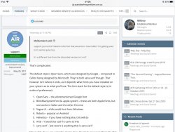
The default style is Open Sans, which was designed by Google – compared to Calibri being designed by Microsoft. They're both sans-serif though. That however isn't where it ends, as it depends what fonts you have installed on your system as to what you'll see. The font stack for the default style is (in order of preference):
  1. Open Sans – the aforementioned Google font
  2. BlinkMacSystemFont & -apple-system – these are both Apple fonts, but one works in Safari and the other Chrome
  3. Segoe UI – a Microsoft font from Windows
  4. Roboto – popular on Android
  5. Helvetica – if you have nothing else, this will do
  6. Arial – it would be sad if it came to this
  7. sans-serif – last resort is anything that is sans-serif
Meanwhile, if you are using the classic style, the stack goes something like this:
  1. Roboto
  2. Helvetica
  3. Arial
  4. sans-serif
Like dajop, I don't like the 'avatar' circles or whatever one calls them. I wish they'd disappear. They're too large and distracting, and to my mind pointless.

I use avatars to help navigate the page.
 
The Frequent Flyer Concierge team takes the hard work out of finding reward seat availability. Using their expert knowledge and specialised tools, they'll help you book a great trip that maximises the value for your points.

AFF Supporters can remove this and all advertisements

Sorry I find the new style harder to read.
Also just uploaded photos to a post.Much slower than the previous version and will really bug me doing TRs especially when using a ship's internet.
 
Both AFF Style (Classic) and AFF Style are app style. Both awful. Surely there's a setting to show the desktop version on the smartphone?
You might be one of the few that doesn't want something that resembles an app. I don't think I have the answer you are looking for.
If I am looking at a thread that has a thousand posts and was started 3 years ago and it is marked that I have posted in the thread and given that this post (or posts) was not recent,

How do I find my earlier comments?
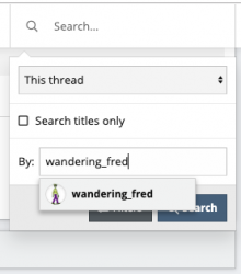
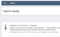
That's a tough one, and not something I have needed to work out before. My gut would tell me that when you are in the thread you need to hit the search box, and where it says "everywhere" as a location, change it to "this thread". You can then add your username to the "By: Member" section, and hit search, leaving the query blank.

Screen Shot 2019-04-13 at 11.43.05 pm.png

Screen Shot 2019-04-13 at 11.44.37 pm.png
Oh, I’m not worried about the public domain issue; more just puzzled about it adding what seems to be clutter that is not generally relevant.
I think you'll find no clutter has been added as it was always there, you just didn't notice it before.
 
Also just uploaded photos to a post.Much slower than the previous version and will really bug me doing TRs especially when using a ship's internet.
It's interesting you say that, as I have been uploading screenshots all day and they've been flying along. In my view, speed has increased. Of course, today my internet could actually be working and conversely your internet could be running slowly. It's very subjective.
 
D3FF3B54-446B-4EAE-8BF6-FCC9DFF6AFF7.jpeg


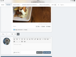
My immediate feedback is the layout. The actual forum content is squished into a narrow middle section, with lots of real estate being taken up with profile icons and the side bar.

The events function is of no value to all bar a small number of members who meet vs the much larger brownsing audience.

It would be nice to see the content go further across the page to stop so much scrolling - this is viewed on an iPad.
 
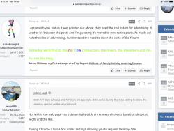
I agree with you, but as it was pointed out above, they need the real estate for advertising. It used to be between the posts and I'm guessing it's moved to next to the posts. As much as I hate the idea of advertising, I understand the need to cover the costs of the forum.
 
Both AFF Style (Classic) and AFF Style are app style. Both awful. Surely there's a setting to show the desktop version on the smartphone?

Not within the web page - as it dynamically adds or removes elements based on detected width and the like.

If using Chrome it has a box under settings allowing you to request Desktop Site
 
One thing I miss on the desktop version is the ^ (up arrow) to get to the top so you can then click on alerts, now you need to manually scroll up (AFF Style). On my phone (AFF Style also) it's not a problem as there's a bar at the top docked constantly that has the alerts icon.

While there is a bar on the desktop version too, it doesn't have the alerts icon on it.
 
One other thing with alerts, if you had multiple 'likes' on a post, it would only show 1 alert until you then viewed that.

Now, every person that likes it shows up as an alert rather than aggregating.... so generates a whole heap more alerts.

So an example, let's say 5 people liked a post, it'd show 1 alert. Once you then viewed that alert, if another 3 people liked you'd see 1 more alert. In the new world you'd see 8 alerts......
 
One thing I miss on the desktop version is the ^ (up arrow) to get to the top so you can then click on alerts, now you need to manually scroll up (AFF Style). On my phone (AFF Style also) it's not a problem as there's a bar at the top docked constantly that has the alerts icon.

While there is a bar on the desktop version too, it doesn't have the alerts icon on it.

Just to clarify, I've found an arrow hiding on the bottom right corner but it looks like you need to scroll a bit before it will show.
 
You might be one of the few that doesn't want something that resembles an app. I don't think I have the answer you are looking for.
I think you'll find no clutter has been added as it was always there, you just didn't notice it before.
I think you will find that many, like me, @JohnK and I'm presuming @JohnM were using the default Xenforo layout, not the AFF one. It was relatively clutter free. Now Xenforo has gone to the tablet world, there's no such compact choice currently.

e.g.

This:

160318

Rather than This:

160317
 
Last edited:
One thing I noticed if I insert a link without putting text in, it makes it look like an advertisement. I don't like that at all.

eg:

Text linking to below hotel

vs


That happens on Fb too. Sometimes it looks good. Just trying the picture upload now.

3138A792-8EA5-4B2A-8761-44DE752969E3.png

Ok, that’s way faster than a couple of weeks ago. Sorry drron.
 
Last edited by a moderator:
Struggling to understand the benefits on an iPad. I agree with Milboo - not that I can press Agree button. What’s the point of only using 60% of the screen size?

At 40, I must be getting old! I’m sick of the changes.
 
Status
Not open for further replies.
Back
Top