Feedback on the Xenforo 2.1 Upgrade

Status
Not open for further replies.
There seems to be a problem with some old link redirections which can be frustrating for users clicking old links or bookmarks (and which you also probably want to maintain and keep the SEO value of those links).

When visiting my bookmarked link:

I get stuck in a redirection loop, which the browser eventually aborts at:
 
Last edited:
It's not so much the app style it's assuming everyone on a smartphone wants to use the tablet/mobile version. The new version is very difficult to read posts such as where one posts ends and anothet post begins.

I don't much like Flyertalk but even they have a setting "View Full Site".

I just want to make sure you understand that it is not the management of AFF that has decided that everyone on a smartphone wants to use the tablet/mobile version. This is how the software was designed and we have little input in this regard.

On the topic of Flyertalk, I think you'll find the reason this still exists there is because the software they're using was released around the time smartphones were just gaining popularity and was probably designed prior to smartphones. I think they're on a heavily modified version of vB 4 (which hit EOL (end of life) a while ago – so is dead in the water.

I found this on another website:

vb5 is coded mobile responsive. vb4 is not but has mobile style which has stripped a lot of stuff. vb3 not mobile.

I imagine if Flyertalk was ever able to work out how to upgrade to vBulletin 5 (their parent companies are the same, so it's not inconceivable, but does make you wonder why they haven't) then you would lose your "View Full Site" to a "responsive design" setup.
 
The Frequent Flyer Concierge team takes the hard work out of finding reward seat availability. Using their expert knowledge and specialised tools, they'll help you book a great trip that maximises the value for your points.

AFF Supporters can remove this and all advertisements

My initial opinion of the new format wasn't that good, however now that I've spent some time playing around and learning the new way - I think it's a pretty good improvement.

I agree with comments on the sidebar and the use of space, but it's certainly not a big issue for me. FWIW I've got a membership that eliminates ads, so I can't comment on that issue.
 
There seems to be a problem with some old link redirections which can be frustrating for users clicking old links or bookmarks (and which you also probably want to maintain and keep the SEO value of those links).

When visiting my bookmarked link:

I get stuck in a redirection loop, which the browser eventually aborts at:

That's very odd as we actually checked while we were testing and URL's remained the same. While I cannot explain how that link would have worked before, the correct URL for a forum always contains a number (it's ID) on the end. Such as https://www.australianfrequentflyer.com.au/community/forums/virgin-australia-velocity.90/

We actually chose not to hard code a word into URL's in September 2017 to avoid issues like this. For example, I could if I wanted change the name of that forum to whatever I liked, but the ".90" at the end would just grab the new forum title and redirect me. With a hard coded word I would lose this flexibility.

I have just used www.archive.org to work out your link comes from before the Xenforo transition. This means there has probably been a redirection in place for the better part of 18 months that is no longer in place. I would imagine we have quite a lot of SEO from post September 2017 to rely on.
 
On the mobile I can't see a way to backtrack pages from the top of the thread .... you can from the bottom. I thought you could do this on the old system. Maybe the shortcut arrow should point down.
 
An an interchangable user of both iPhone and PC throughout the day, and an IT dinosaur, I don't have real problems with either mode with the upgrade (almost going to call it an enhancement :)), but definitely 'AFF (Classic) style for me - gets rid of the carp that takes up 1/3 of the screen on a phone (facebook, twitter icons and lots of space.). A pity one can't use fluid width with it, though, on the desktop.

Observation: on a PC, at least, the smiley icon is a white face with the AFF style, and a black face with the AFF (Classic) style.

i think I saw upthread that the presentation of links may be looked at. Blue for hyperlinks rather than underlining I hope.
 
Last edited:
On the whole I think the upgrade delivers a neutral outcome for me.:confused:

:)Positives:
-Looks and feels a little cleaner within threads.
-Font seems easier to read.
-Photo upload is much quicker.

:confused:Undecided:
-New emoji reactions.

:(Negatives:
-Two clicks, rather than one to reach unread posts.
-Loss off “agree” and “informative” buttons. Will be good is support can add something similar once the troubleshooting is done.
- on iPad there’s lots of clutter to the right, so I’ll have to get used to using in portrait mode I suppose.

:mad:Very negative:
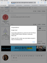
The upgrade didn’t kill off this nonsense...
643858B6-DB77-4FCF-B88B-C25E441988EB.png643858B6-DB77-4FCF-B88B-C25E441988EB.png
 
On the mobile I can't see a way to backtrack pages from the top of the thread .... you can from the bottom. I thought you could do this on the old system. Maybe the shortcut arrow should point down.
I had noticed that too, there is a way of getting it back with some code, however I have seen what it ends up looking like on mobile and it's not as pretty, probably why they took it out. It also eats up even more screen real estate.

Notably, the page navigation appears at the top and bottom on desktop, but only at the bottom on mobile.
The upgrade didn’t kill off this nonsense...
That has nothing to do with us. I see it on countless other sites all day long.
 
That has nothing to do with us. I see it on countless other sites all day long
Actually it does.

It seems the trigger for the pop up is embedded in one or more advertisements that appear on AFF.

It may be that you’ve not been able to resolve it with the third party providing the advertising, but it significantly detracts from the user experience which has everything to do with you.

You may get it on countless sites, but I only experience it on AFF.
 
Well this is a bummer - I can only set the style across all devices. I prefer AFF Style on my PC as I can stretch the forum across my page, but on my mobile device I prefer AFF Style (Classic), but it doesn't take up the whole screen real estate so everything is really squished.
 
In response to feedback posted in this thread we have 2 changes to share:
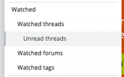
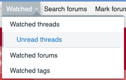
  • A new link (Unread threads) has been added to the navigation bar under Watched Threads to take you directly to only your Unread Watched Threads. This should reduce the number of clicks to get to this vital function. The link generates a new search every time it is clicked, so if you want to save a bookmark instead you will need to do so before clicking. The following link would need to be saved: https://www.australianfrequentflyer.com.au/community/whats-new/posts/?watched=1&unread=1
160348.160349
  • Members who do not see ads will now no longer see the sidebar widgets when viewing a thread; they remain everywhere else. This should make for a better viewing experience on devices like iPads (or other tablets) where a landscape orientation is frequently used.
 
Actually it does.

It seems the trigger for the pop up is embedded in one or more advertisements that appear on AFF.

It may be that you’ve not been able to resolve it with the third party providing the advertising, but it significantly detracts from the user experience which has everything to do with you.

You may get it on countless sites, but I only experience it on AFF.
I get it on many sites including Flyertalk. I have yet to experience it on AFF though.
 
You may get it on countless sites, but I only experience it on AFF.
I get it on many sites including Flyertalk. I have yet to experience it on AFF though.

As there is already a thread on this issue might I suggest that such discussion continues there and not in this thread, which concerns an entirely different topic. Thanks.
 
In response to feedback posted in this thread we have 2 changes to share:
  • A new link (Unread threads) has been added to the navigation bar under Watched Threads to take you directly to only your Unread Watched Threads. This should reduce the number of clicks to get to this vital function. The link generates a new search every time it is clicked, so if you want to save a bookmark instead you will need to do so before clicking. The following link would need to be saved: https://www.australianfrequentflyer.com.au/community/whats-new/posts/?watched=1&unread=1

  • Members who do not see ads will now no longer see the sidebar widgets when viewing a thread; they remain everywhere else. This should make for a better viewing experience on devices like iPads (or other tablets) where a landscape orientation is frequently used.
Two thumbs up to the full page width!
 
In response to feedback posted in this thread we have 2 changes to share:
  • A new link (Unread threads) has been added to the navigation bar under Watched Threads to take you directly to only your Unread Watched Threads. This should reduce the number of clicks to get to this vital function. The link generates a new search every time it is clicked, so if you want to save a bookmark instead you will need to do so before clicking. The following link would need to be saved: https://www.australianfrequentflyer.com.au/community/whats-new/posts/?watched=1&unread=1

  • Members who do not see ads will now no longer see the sidebar widgets when viewing a thread; they remain everywhere else. This should make for a better viewing experience on devices like iPads (or other tablets) where a landscape orientation is frequently used.


Thank you for the changes.
 
Both AFF Style (Classic) and AFF Style are app style. Both awful. Surely there's a setting to show the desktop version on the smartphone?
Have you tried your phone's browser settings? On Chrome and Firefox there's a checkbox to request desktop site.
 
Have you tried your phone's browser settings? On Chrome and Firefox there's a checkbox to request desktop site.
I believe Xenforo checks what browser/OS you’re using and displays elements accordingly. That said, I know there are ways that browsers can ‘fool’ websites as to what they are and a setting like that might work for John.
 
As there is already a thread on this issue might I suggest that such discussion continues there and not in this thread, which concerns an entirely different topic. Thanks.
I’m aware of that. I started the thread to which you refer.

But we’ll have to agree to disagree on whether it’s a different topic.

The forum was modified, or “upgraded” to use your word, then you sought feedback:

Please post your feedback on the Xenforo 2.1 upgrade in this thread and we will try to respond in a timely manner.


My feedback remains that a known problem wasn’t resolved by the changes and as a result it remains a poor UX.

None of this is said to detract from what I expect is a significant amount of back-end work you’ve done to get the changes tested and up for the live site.

And I note you’ve spent a significant amount of the weekend working on it and assisting members with issues and responding to feedback. The changes to the side bar seem well received and your advice on classic mode has made my screen cleaner. It’s appreciated. Thanks.

So my feedback - as requested - is that there isn’t an improvement in UX. But I also take your point and will post further grumbles about the pop ups in the other thread.
 
Status
Not open for further replies.
Back
Top