New QF livery and logo

Status
Not open for further replies.
Having seen the vid and a few spotters pics, the new style is fine with me. A more modern approach is positive as you will recall their Retro 738's satisfied the Old School recently. The retro roo under the coughpit is quite classy and keeps the historical aspect going for me.
 
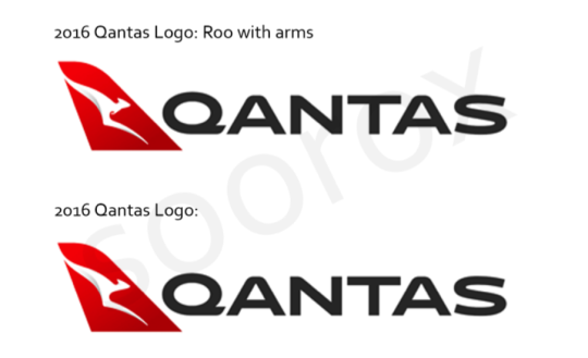
I've added arms onto the new logo to see how it looks: What do you guys think? I personally prefer a roo with arms! No copyright intended.


tumblr_ofqdgbKB2U1s12f1yo1_540.png
 
The Frequent Flyer Concierge team takes the hard work out of finding reward seat availability. Using their expert knowledge and specialised tools, they'll help you book a great trip that maximises the value for your points.

AFF Supporters can remove this and all advertisements

I love the roo with that silver shadowing for depth. I don't really feel anything here or there regarding the paws. The font - looks like some school kid got their stencil out rather than someone with experience in advertising/marketing. The straightness of the Q underneath reminds me of kids trying to write with a straight so you put a ruler underneath:D. I prefer the bolder font and wouldn't have minded them slimming it down a little but not to this degree. Overall the plane looks great though. Looking forward to seeing it in the flesh.
 
I love the roo with that silver shadowing for depth. I don't really feel anything here or there regarding the paws. The font - looks like some school kid got their stencil out rather than someone with experience in advertising/marketing. The straightness of the Q underneath reminds me of kids trying to write with a straight so you put a ruler underneath:D. I prefer the bolder font and wouldn't have minded them slimming it down a little but not to this degree. Overall the plane looks great though. Looking forward to seeing it in the flesh.

Exactly - in the comparison pic above the paws are about 3 pixels..
It's stylised people.
 
Exactly - in the comparison pic above the paws are about 3 pixels..
It's stylised people.

Yes. And many are saying that the stylising has gone too far. Stylising doesn't necessarily work. Bring back the paws. Sometimes the detail matters. Even just 3 pixels.
 
It's a paint job... get over it. You guys have the other white fuselage with red writing on the vertical stabiliser if that helps, or tiger stripes and stars.
 
While Qantas has been very quick in updating website, app, print advertising, heck even the seat maps, noted they have missed a bit on third party advertising.

Sideline digital advertising screens during A-League games this weekend were old logo (quick change).
Wallabies played in the wee hours with old logo in the shirt (granted this can take a bit more time to change - though five games in the Euro tour).

They have updated the digital screens at the cricket in Perth

And most importantly RedRoo hasn't updated their avatar !
 
Last edited:
Sponsored Post

Struggling to use your Frequent Flyer Points?

Frequent Flyer Concierge takes the hard work out of finding award availability and redeeming your frequent flyer or credit card points for flights.

Using their expert knowledge and specialised tools, the Frequent Flyer Concierge team at Frequent Flyer Concierge will help you book a great trip that maximises the value for your points.

Also didn't realise but Jetstar is on their third livery, although the tail and belly has stayed the same so far more gradual changes

Started with jetstar.com in small font above the windows. Then went to a bigger Jetstar.com over the windows.
And currently a big Jetstar*
 
While Qantas has been very quick in updating website, app, print advertising, heck even the seat maps, noted they have missed a bit on third party advertising.

Don't worry, they haven't even changed the airport digital signage.
 
It's a paint job... get over it. You guys have the other white fuselage with red writing on the vertical stabiliser if that helps, or tiger stripes and stars.

It's a paint job? I thought it was a total re-branding including PJs, website, QFF cards .. basically anywhere 'Qantas' appears in brand form. :confused:

get over it

Is that a directive from management, or crew?
 
Now all they need to do is a Retro Roo 3 with the V Jet Tail and then they can have a actual line up of 737s to reflect this vision, of course they must be fast to do this as there not many 737s with the 1987 version left.
 
I am very curious to see what the new bag tags look like.
 
Status
Not open for further replies.

Enhance your AFF viewing experience!!

From just $6 we'll remove all advertisements so that you can enjoy a cleaner and uninterupted viewing experience.

And you'll be supporting us so that we can continue to provide this valuable resource :)


Sample AFF with no advertisements? More..
Back
Top