You are using an out of date browser. It may not display this or other websites correctly.
You should upgrade or use an alternative browser.
You should upgrade or use an alternative browser.
Feedback on the AFF website & brand refresh
- Thread starter admin
- Start date
- Joined
- Jul 8, 2007
- Posts
- 2,912
- Qantas
- Platinum 1
- Virgin
- Red
- Oneworld
- Emerald
Yes they do.So Points Hacks owns AFF, does it?
I’ve spent a bit of time thinking about this post, what I’m going to say, the tone etc. But then I realised that what I'm about to announce isn't actually that important to anyone other than myself, so I'll keep it brief and tell it as it is.
After 24 years, I’m finally hanging up my AFF hat! As many of you would know I started AFF as pretty much a hobby website in 1998. I never dreamed it would morph into the AFF we know today with it's vibrant community, insightful editorial articles, and professional services (via our sister website, Frequent Flyer Solutions).
But it's now time to...
- admin
- Replies: 0
- Forum: Community Announcements
PineappleSkip
Established Member
- Joined
- Mar 30, 2007
- Posts
- 3,352
- Qantas
- Platinum
- Virgin
- Red
Appreciate the "revert to classic" option (I've done that too) and the efforts to increase the font readability and font size.
I have no idea why the "new" inverted Finnair logo is intended to signify. The "old" logo isn't that old; I remember not so long ago it was new. I can understand why you'd let go of the "old" FrequentFlyer branding, which harks back to 1990s Qantas IIRC, but that is bathwater. Please consider keeping the baby.
Cheers skip
RooFlyer
Veteran Member
- Joined
- Nov 12, 2012
- Posts
- 31,574
- Qantas
- Platinum
- Virgin
- Platinum
- Star Alliance
- Gold
For those who have been using the site for many years as it was originally established, the Points-Hackification is sad but probably inevitable.
I'm not paid to say this
I think the re-brand is poor, but again, on the forum pages its less of an assault (and thanks to @DejaBrew at least, I dare say the faults will be ironed out), so I'm continuing the old style that I've used since the last site 'refresh' - which I recall got the same shock, horror, but we all adapted. Remember when they did away with the app
Supersonic Swinger
Active Member
- Joined
- Aug 15, 2006
- Posts
- 974
- Oneworld
- Sapphire
- SkyTeam
- Elite Plus
If you look at the site on the Wayback Machine, beyond the community forums the focus was more on News & Views, Trip Reports, Community Insights, Member Blogs, etc. Now 2 of the 5 top dropdowns are "Credit Cards" and "Guides & Tools" which defaults to "Credit Card Points Transfer Assistant".I'm not paid to say this(promise) but I simply cannot see that. For me, its the same FF site, with all the tips and lessons from experts and each other, Matt's editorial pieces, the Gazette, webinars, podcasts. I never see credit card stuff.
I understand the business rationale, becoming a more targeted version of Canstar / Finder / money.com.au. The shift has been slow and subtle, but it does limit the impartiality of the editorial content, like the travel bloggers who have morphed their content to drive revenue from affiliate links and sign on bonuses. One can only hope that the Forums remain unpolluted.
Read our AFF credit card guides and start earning more points now.
AFF Supporters can remove this and all advertisements
clifford
Established Member
- Joined
- Jul 6, 2004
- Posts
- 4,197
- Qantas
- Platinum
- Virgin
- Platinum
- Star Alliance
- Gold
Well, we all have feet that we can vote with, if so inclined. Personally, I think the changes to the website are change for the sake of change. More negative for me than positive. A bit like what's happened to Expert Flyer...that the Forums remain unpolluted.
- Joined
- Jun 5, 2010
- Posts
- 1,839
- Qantas
- Platinum 1
- Virgin
- Platinum
- Oneworld
- Emerald
I visit AFF throughout the day very frequently (imho) but just look for new posts, so the 'new posts' link is essentially the only way I get here. So I don't see the credit card or other pages mentioned at all.
Having said that, I've just clicked to revert to the old look for the first time since the refresh and - what a relief. It's like a breath of fresh air. Not literally fresh since it's old, but it's so so much easier on the eyes!!
Having said that, I've just clicked to revert to the old look for the first time since the refresh and - what a relief. It's like a breath of fresh air. Not literally fresh since it's old, but it's so so much easier on the eyes!!
- Joined
- May 10, 2012
- Posts
- 573
- Virgin
- Platinum
Yes me too. The other day, though, I changed it to Default Style because I like the purple, but when I opened the site today on my phone my brain had a meltdown....nnnoooo it's all wrooooongI visit AFF throughout the day very frequently (imho) but just look for new posts, so the 'new posts' link is essentially the only way I get here. So I don't see the credit card or other pages mentioned at all.
- Joined
- Jul 8, 2007
- Posts
- 2,912
- Qantas
- Platinum 1
- Virgin
- Red
- Oneworld
- Emerald
Hi @admin, not sure if this is already on the radar, but on the Manage Membership & Billing page, there's an issue with the instructions for making changes to your membership -:


- Joined
- Apr 6, 2018
- Posts
- 2,898
Hi @admin, not sure if this is already on the radar, but on the Manage Membership & Billing page, there's an issue with the instructions for making changes to your membership -:
View attachment 462749
- Joined
- Jul 8, 2007
- Posts
- 2,912
- Qantas
- Platinum 1
- Virgin
- Red
- Oneworld
- Emerald
- Joined
- Jul 8, 2007
- Posts
- 2,912
- Qantas
- Platinum 1
- Virgin
- Red
- Oneworld
- Emerald
Not sure if this is by design, an oversight, or just pointing to pending enhancements, but the "Community" menu on the main site appears to be using a "mega menu" format, where it is ideally suited to a standard menu.
To explain....
The "Latest News" menu uses the mega menu format given other articles/sub-sections are being displayed in the menu -:

When you look at the "Credit Cards" menu, it's using the standard menu layout -:

However, when you look at the "Community" menu, it displays content in the same format as the "Credit Cards" menu, yet it uses the same menu layout/size as the "Latest News" mega menu -:

This results in excessive empty menu space for no value and is inconsistent with the other menu layouts.
To explain....
The "Latest News" menu uses the mega menu format given other articles/sub-sections are being displayed in the menu -:

When you look at the "Credit Cards" menu, it's using the standard menu layout -:

However, when you look at the "Community" menu, it displays content in the same format as the "Credit Cards" menu, yet it uses the same menu layout/size as the "Latest News" mega menu -:

This results in excessive empty menu space for no value and is inconsistent with the other menu layouts.
- Joined
- Jul 8, 2007
- Posts
- 2,912
- Qantas
- Platinum 1
- Virgin
- Red
- Oneworld
- Emerald
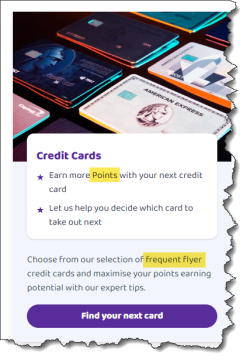
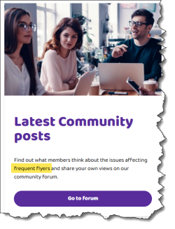
Also on the main site, there is inconsistent use of capitalisation...
Whilst I can understand why "Frequent Flyers" is using proper case, this is inconsistently applied elsewhere on site. At the same time, I don't understand why "Come" and "Travel" are capitalised?

There will be other examples of this, but I wanted to highlight a few.
Whilst I can understand why "Frequent Flyers" is using proper case, this is inconsistently applied elsewhere on site. At the same time, I don't understand why "Come" and "Travel" are capitalised?


There will be other examples of this, but I wanted to highlight a few.
- Joined
- Feb 19, 2009
- Posts
- 3,837
- Qantas
- Platinum
- Oneworld
- Emerald
- Star Alliance
- Gold
- Joined
- Jul 8, 2007
- Posts
- 2,912
- Qantas
- Platinum 1
- Virgin
- Red
- Oneworld
- Emerald
I'm using Snagit. It's a great screen capture tool that works on both Windows and Mac. There will be other options out there, but this is one of the better ones.I just want to know where @DejaBrew gets his clipping effect from - I'd like to use that sometime!

Snagit
Screen capture and recording software for Windows and Mac. Quickly get images and videos. Start your free trial today!
- Joined
- Jul 8, 2007
- Posts
- 2,912
- Qantas
- Platinum 1
- Virgin
- Red
- Oneworld
- Emerald
A lot of the feedback so far has been about the purple - too much, too bright etc. For what it's worth, I don't personally hate the new branding and theme, but I don't love it either. I've lived with the new theme since launch and have been trying to just let it all sink in and reserve judgement until I'd had some time to "acclimate". But something has been bugging me and I've struggled to put my finger on it... until now. This is clearly a subjective opinion, but here goes...
I think the problem is that the overt use of vivid purple in the site theme doesn't gel with the new logo. Let's consider the old theme and logo for a moment -:
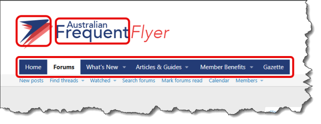
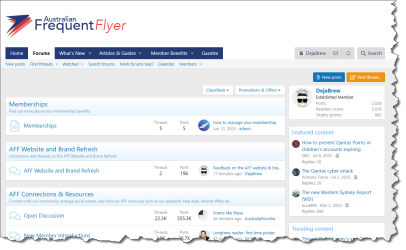
As highlighted above, the (let's just call it) "AFF blue" in the logo is carried into the text component of the logo, and is also carried over to the menu bar. Whilst not always the same shade, blue is carried over as a consistent theme for the rest of the forum page, creating a consistent theme that's tied in with the AFF logo -:
When we look at the new logo, the purple is there, but it is a significantly less prominent colour in the overall logo design -:
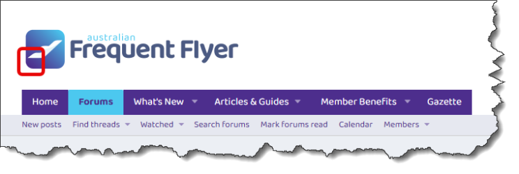
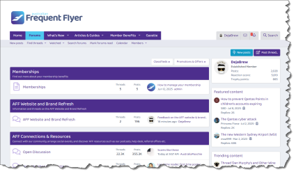
As highlighted above, it's basically just the bottom-left corner of the logo. Sure, the colour has been carried into the menu bar, but as that purple forms such an inconspicuous part of the overall logo design, its subsequent prominent use throughout the rest of the forum theme seems incongruous and inconsistent with the updated logo/brand -:
Now in saying all of that, I recognise that this vivid purple has been made a core colour of the refreshed AFF brand identity and you can't just ignore it with the new forum theme. This leads me to a second observation that you might consider as more of a "suggestion" to balance the new branding whilst appeasing those who find the overt use of purple in the new forum theme a little too much for their taste....
Looking at the "Classic" AFF theme, there is consistent use of the linear gradient blue/white in the header blocks for each forum section -:
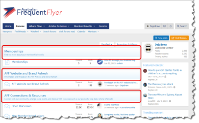
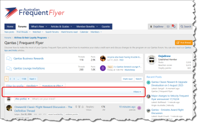
This same colouring flows through to the various sub-sections -:
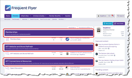
By contrast, the "New" AFF theme uses vivid purple for the header blocks of each forum section -:
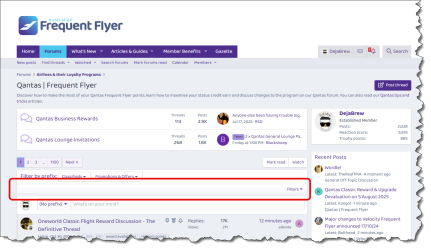
However this seems to transition into a linear gradient styling for the various sub-sections (which is much easier on the eye) -:
Now, if we were to apply the same sort of consistent colour styling to the main forum page, we'd get something like this -:
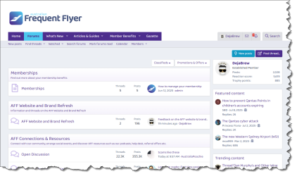
I suspect something like the above example might offer a way to still incorporate/hero the vivid purple from the updated branding, whilst being more consistent in terms of the theme colouring - especially when compared to the "Classic" theme - and also dialing back the excessive use of vivid purple that other members have found to be overly jarring.
Just my 2c worth, but hope it's helpful
I think the problem is that the overt use of vivid purple in the site theme doesn't gel with the new logo. Let's consider the old theme and logo for a moment -:

As highlighted above, the (let's just call it) "AFF blue" in the logo is carried into the text component of the logo, and is also carried over to the menu bar. Whilst not always the same shade, blue is carried over as a consistent theme for the rest of the forum page, creating a consistent theme that's tied in with the AFF logo -:

When we look at the new logo, the purple is there, but it is a significantly less prominent colour in the overall logo design -:

As highlighted above, it's basically just the bottom-left corner of the logo. Sure, the colour has been carried into the menu bar, but as that purple forms such an inconspicuous part of the overall logo design, its subsequent prominent use throughout the rest of the forum theme seems incongruous and inconsistent with the updated logo/brand -:

Now in saying all of that, I recognise that this vivid purple has been made a core colour of the refreshed AFF brand identity and you can't just ignore it with the new forum theme. This leads me to a second observation that you might consider as more of a "suggestion" to balance the new branding whilst appeasing those who find the overt use of purple in the new forum theme a little too much for their taste....
Looking at the "Classic" AFF theme, there is consistent use of the linear gradient blue/white in the header blocks for each forum section -:

This same colouring flows through to the various sub-sections -:

By contrast, the "New" AFF theme uses vivid purple for the header blocks of each forum section -:

However this seems to transition into a linear gradient styling for the various sub-sections (which is much easier on the eye) -:

Now, if we were to apply the same sort of consistent colour styling to the main forum page, we'd get something like this -:

I suspect something like the above example might offer a way to still incorporate/hero the vivid purple from the updated branding, whilst being more consistent in terms of the theme colouring - especially when compared to the "Classic" theme - and also dialing back the excessive use of vivid purple that other members have found to be overly jarring.
Just my 2c worth, but hope it's helpful
Mr_Orange
Senior Member
- Joined
- Jun 17, 2013
- Posts
- 5,845
You are wasting the layers of skin on your fingertips!Just my 2c worth, but hope it's helpful
- Joined
- Jul 8, 2007
- Posts
- 2,912
- Qantas
- Platinum 1
- Virgin
- Red
- Oneworld
- Emerald
Because you think the feedback will be ignored, or just that nobody will use the new theme regardless of how it’s modified?You are wasting the layers of skin on your fingertips!
Mr_Orange
Senior Member
- Joined
- Jun 17, 2013
- Posts
- 5,845
This.Because you think the feedback will be ignored, or just that nobody will use the new theme regardless of how it’s modified?
- Joined
- Jul 8, 2007
- Posts
- 2,912
- Qantas
- Platinum 1
- Virgin
- Red
- Oneworld
- Emerald
Worst case scenario? Sure.This.
The way I see it though is that the forum is largely community run so I’m happy to offer some input/assistance as a member who benefits from that community. I don’t have the same level of flying knowledge as many others and can’t always help out so much there, but this sort of stuff is well and truly in my wheelhouse and is one way I can contribute and “give back”.
Become an AFF member!
Join Australian Frequent Flyer (AFF) for free and unlock insider tips, exclusive deals, and global meetups with 65,000+ frequent flyers.AFF members can also access our Frequent Flyer Training courses, and upgrade to Fast-track your way to expert traveller status and unlock even more exclusive discounts!

AFF forum abbreviations
Wondering about Y, J or any of the other abbreviations used on our forum?Check out our guide to common AFF acronyms & abbreviations.
Currently Active Users
- downgraded
- http_x92
- Aeryn
- smiliemonster
- Skyhawk
- offshore171
- muppet
- YosemiteP
- tinkybelle
- anat0l
- simmomelb
- pauly7
- M2002queen
- Brizz
- TheRealTMA
- wohoo
- dvt
- tgh
- Pete98765432
- Buzzard
- bjhearne
- lp137
- Ric
- vhojm
- stu961
- leesionn
- somebol
- Willpanzer
- MEL_Traveller
- RB001
- I love to travel
- jase05
- ronaldh
- Sim0n
- SJF211
- ols
- nick.wall
- Flyfrequently
- midnight
- Sequel
- Virgin Bart
Total: 1,559 (members: 46, guests: 1,513)


