Qantas747
Intern
- Joined
- Aug 3, 2019
- Posts
- 67
- Qantas
- Gold
- Virgin
- Silver
It appears that the homepage of qantas.com has now been updated to the new font.
At first glance, the white background behind the booking area is not as easy on the eye as the previous black. There's a lot of white!
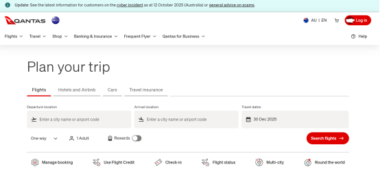

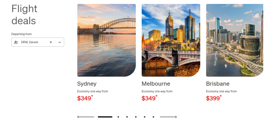
The carousel banner image from the top seems to be gone. It's also a shame to see the font finally change online, too. I have really liked Ciutadella, and it fits QF so well online and in the terminals. It still exists away from the homepage, if only for now...

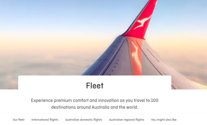
Overall, I think it could have been much worse. A few tweaks to the booking engine would be nice to break up all the Eurowhite, but I think this is one enhancement™ we might be able to live with. However, the QFF profile page has not yet been updated - and that will be the real test, given how clean and clear it currently is.
At first glance, the white background behind the booking area is not as easy on the eye as the previous black. There's a lot of white!


The carousel banner image from the top seems to be gone. It's also a shame to see the font finally change online, too. I have really liked Ciutadella, and it fits QF so well online and in the terminals. It still exists away from the homepage, if only for now...


Overall, I think it could have been much worse. A few tweaks to the booking engine would be nice to break up all the Eurowhite, but I think this is one enhancement™ we might be able to live with. However, the QFF profile page has not yet been updated - and that will be the real test, given how clean and clear it currently is.


