melbkate
Member
- Joined
- Oct 6, 2013
- Posts
- 173


Oh I only go there for info and it is easy to find. Used to be the case here too.. I have no problem with avatars or pics but thinking they are dominating the space possibly.I check into Whirlpool if I want to chat about TV or technology but I certainly don't spend more than a couple of minutes in it a day. It's not a social hang out for me. I like having an Avatar. Love seeing photos.

AFF Supporters can remove this and all advertisements
Thanks I posted about maybe the sidebox being dominant and perhaps dictating the amount of space in the comment box which even for one sentence ends up being huge and mostly white space - not sure if that is why.You might not be using a very wide screen then.
I'll concede, the design tends to take up more space than it did before, however we have actively worked to remove extraneous information from profiles attached to posts to minimise this. The end result is also a website that is able to be used on a mobile phone much more easily than before, and this does require page elements to be larger to accommodate fat fingers. I can't tell you the number of times the old website got the better of me on my mobile phone. It just wasn't designed for smart phones.
No offence, but if AFF looked like Whirlpool I would resign
I can see what you mean regarding the amount of information and spacing between Whirlpool (1 line), the old layout (~3 lines) and the new layout (perhaps ~6 lines). We are a different website with a different audience though.
It's a pity the old site isn't visible any more as people seem to have forgotten how much white space was there before.Thanks I posted about maybe the sidebox being dominant and perhaps dictating the amount of space in the comment box which even for one sentence ends up being huge and mostly white space - not sure if that is why.
")
It's a pity the old site isn't visible any more as people seem to have forgotten how much white space was there before.
On the old system if you replied with just a one line reply and the person had a signature it would be a huge amount of white space underneath. No one ever complained about that.
My only niggle is that the text is in sans serif font: serif is much easier to read but isn't as "modern/hipster-ish". First world problems.
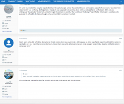
One last question / comment - is it the spread out info in the avatar side box that causes the comment box to be filled with so much whitespace? If it is could it be shrunk? See screen shot.
much as he'd like it to be!
It's a pity the old site isn't visible any more as people seem to have forgotten how much white space was there before.
On the old system if you replied with just a one line reply and the person had a signature it would be a huge amount of white space underneath. No one ever complained about that.
The wink looks a bit worse for weather.


The app is defunct now that the website has moved platforms.for some unknown reasons, I cant log in with the app after the website update. Is anyone having the same problem?
")
for some unknown reasons, I cant log in with the app after the website update. Is anyone having the same problem?
No app has been selected as yet.ohhh..that explains it. Does the administrator has an ETA when the app will be resurrected??
It is a real pain that the app does work anymore.......
Later rather than sooner.ohhh..that explains it. Does the administrator has an ETA when the app will be resurrected??
Is this new software more data usage hungry? I only have 1GB/month and don't do very much on phone other than AFF and Line chat to wife.
The app is defunct now that the website has moved platforms.
The app is dead!
It is a real pain that the app does work anymore.......
The Mobile data usage has increased the past few days. I'm not viewing anywhere near as many threads as I used to view with vBulletin.
Is this new software more data usage hungry?
Not sure about the general forums, but any Trip Reports will likely be substantially larger given photos can now be 5Mb each - previously they were compressed to about 100k each
The app is defunct now that the website has moved platforms.
)