Feedback on the AFF website & brand refresh

The issue with X on pop-ups being the same purple as the background so you cant see the X until you accidently highlight is still a thing.

1754878211623.png
 
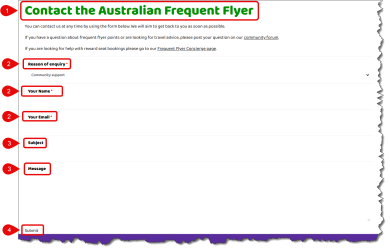
On the "Contact us" page, there are a few issues -:

1754885780451.png
  1. The header text should be changed to purple to maintain consistency with the rest of the site
  2. Inconsistent use of upper/lower case (e.g. "Reason for enquiry" vs "Your Name")
  3. Form can be submitted without entering any content into the Subject or Message fields, meaning that you can receive a form submission that simply contains
    • "Reason for enquiry"
    • "Your Name"
    • "Your Email"
  4. Submit button is currently styled as if it's plain text and the mouse cursor does not change when hovering over the text. From a usability perspective, this means that it's not at all obvious that this is...
    • A button of any sort, or
    • Clickable/hyperlinked text
Just my opinion here, but I would also suggest that the overall form probably needs a little more styling to make each input field more obvious.

When the minimum field requirements are met and the form is submitted, the confirmation screen displays as -:

1754886613180.png
  1. Again, the header text colour is inconsistent with the rest of the site
  2. This text is somewhat incongruous with just having submitted the form
  3. The submission confirmation text should ideally be more obvious
Regarding this text section -:

1754886916369.png
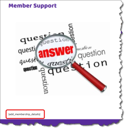
My suggestion would to make this part of the actual form (as opposed to being a text component on the Contact Us page). This would ensure that the text is appropriately changed upon successful form submission.
 
On the "Membership Pricing" page...

1754889430142.gif

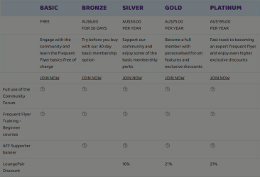
Are these animated exclamation/question mark icons meant to be... well.... that? Wouldn't these be better off as static tick/check icons (e.g. ✅ or similar)?

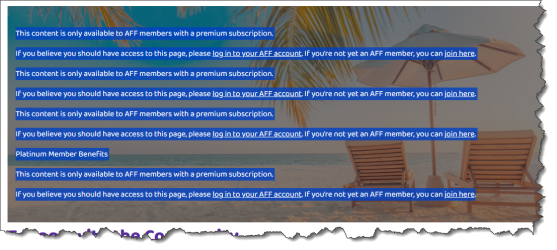
Also, further to @cityliving2's prior observation, the Member Lounge still has some issues (although I appreciate these might be a work in progress)...

1754889883252.png
1754889893405.png
 
I wonder if many of the issues you are identifying were there before hand? It was only that they didn’t have Poirot on the case that they remained undetected. 😆
I know some of the things I've flagged re: the forum theme updates/enhancements were definitely there before, but not sure if the same is true of the main website.
 
Found another "bug" of sorts....

When logged out of the website, the Member Lounge page shows Member Discounts with various purple "Join" call to action buttons -:

1755255891516.gif

However when logged into the site, those same buttons are an off-brand gold/yellow in colour -:

1755255936026.gif
 
You have your 'apple-touch-icon' set for the AFF home page, but none of the forum pages.

Code:
<link rel="apple-touch-icon" sizes="180x180" href="https://www.australianfrequentflyer.com.au/app/themes/aff-sage/public/build/assets/apple-touch-icon-CGR0tkzR.png" />

As I have the AFF forum home page bookmarked, it would be great if you could also have the icon set, so my AFF bookmark looks pretty!
 
It would be nice if there were an integrated backround spell checker. It would likely prevent a lot of fat fingered typos in posts.

Virtually every other bulletin board etc has one, so why not AFF.
 
It would be nice if there were an integrated backround spell checker. It would likely prevent a lot of fat fingered typos in posts.

Virtually every other bulletin board etc has one, so why not AFF.
To me, unashamed and unrepentant grammar snob that I am, I like to see whether someone has proof-read and edited what they wrote before posting it. Rightly or wrongly, it does affect (or should that be “effect”?) my opinion of what they’ve written…
 
Noted this on the mobile site… “Articles & Guides” menu has a down arrow, but none of the other drop-down menu headers do. This is consistent with all other themes so is not specifically an issue resulting from the brand refresh.

IMG_4875.jpeg
 
I'm sure that this is likely on the "to do" list, but just in case it's been missed... you'll need to update the branding on some of your banner advertising shown to unregistered visitors to the forum -:

1755670647468.png
 
Further to my previous posts re: the menu bar styling, I think I've just worked out the main "problem" (Spoiler alert: it's not something that has been uniquely introduced as part of the re-branding)...

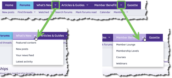
If we look at the "What's New" and "Member Benefits" menu items on the menu bar, there are actually two distinct components to each menu item -:
1755679618071.png
The items circled in red are buttons, as are the items circled in green. However each red and green button works in combination to form a single menu item. To better explain, selecting either of the buttons circled in red would result in being immediately navigated to the following pages...

1755679753955.png

...whereas selecting either of the buttons circled in green would result in expanding the sub-menu options...

1755679809699.png

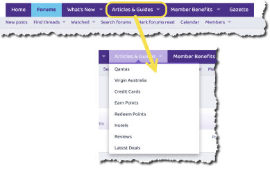
In contrast, the "Articles & Guides" menu item is one single button (including the little down arrow icon) and clicking it will expand a sub-menu -:

1755679889355.png
This basically creates an inconsistent navigation experience and also explains some of the other menu-related observations I've posted prior to today. Now I'll grant you that it doesn't seem like much on the face of it (and I'd agree it's far from mission critical), however I would suggest it becomes far more noticeable when using the mobile version of the site.

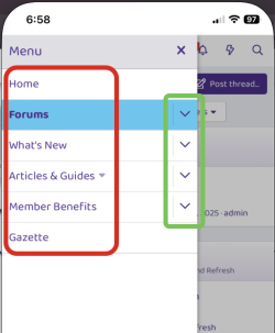
When looking at the menu system on the mobile site, it's very distinctly split into two components - a main button/option (red) and a sub-menu (green) -:

1755680463247.png

Clicking/tapping any of the sub-menu options does precisely what you'd expect (i.e. expand/collapse the relevant sub-menu), however clicking/tapping the main buttons/options immediately send you to a specific page. All, at least, with the exception of the "Articles & Guides" button, which instead expands/collapses a sub-menu.

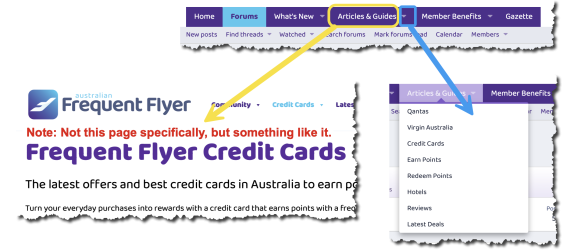
To put it simply, I think what you're missing here is a "main" landing page for "Articles & Guides" to which the user would be navigated when they click/tap that specific button, which would then enable you to have a separate sub-menu button to open up the additional menu options and maintain consistency in navigation - and overall appearance - across all the menu bar items, e.g.

1755681028379.png
Hope that all makes sense :)
 
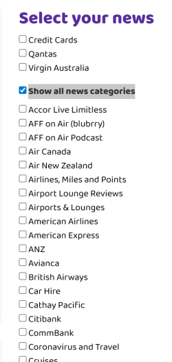
I wonder if "News" stories are being read nearly as much as when the articles were clear and present on the home page?

Also, on the Latest News - Australian Frequent Flyer page, there's a filter for different tags on the articles - these don't seem to save to a cookie or anything, so you'd have to chose each time you visit.

Also, can there be an AVIOS category please? This would potentially span across multiple airline programs and potentially stand-alone articles in future.

1755865126166.png
 
Elevate your business spending to first-class rewards! Sign up today with code AFF10 and process over $10,000 in business expenses within your first 30 days to unlock 10,000 Bonus PayRewards Points.
Join 30,000+ savvy business owners who:

✅ Pay suppliers who don’t accept Amex
✅ Max out credit card rewards—even on government payments
✅ Earn & transfer PayRewards Points to 10+ airline & hotel partners

Start earning today!
- Pay suppliers who don’t take Amex
- Max out credit card rewards—even on government payments
- Earn & Transfer PayRewards Points to 8+ top airline & hotel partners

AFF Supporters can remove this and all advertisements

Become an AFF member!

Join Australian Frequent Flyer (AFF) for free and unlock insider tips, exclusive deals, and global meetups with 65,000+ frequent flyers.

AFF members can also access our Frequent Flyer Training courses, and upgrade to Fast-track your way to expert traveller status and unlock even more exclusive discounts!

AFF forum abbreviations

Wondering about Y, J or any of the other abbreviations used on our forum?

Check out our guide to common AFF acronyms & abbreviations.

Recent Posts

Back
Top