- Joined
- Jun 18, 2002
- Posts
- 1,579
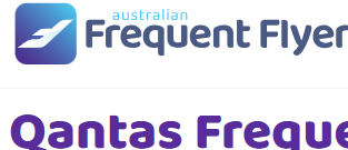
As we announced on Tuesday, AFF is getting a new website and brand identity! Later today, we'll relaunch AFF with a new logo and the website will have a new font & colours.
You can read more about the changes, and the reasons for them, here:

 www.australianfrequentflyer.com.au
The changes to the forum are mainly cosmetic, and the way you navigate around the AFF forum hasn’t changed. But we have overhauled the home page, articles and related pages with a completely new design and user experience. These changes bring AFF into the modern age and should significantly improve your experience when browsing AFF.
We’re starting this thread as a place where you can leave your feedback, discuss the changes and report any bugs or issues that you come across.
It’s inevitable with any major change that there might be some teething issues. Our IT team will endeavour to fix any bugs that you report, and we appreciate your patience as we work through them.
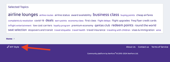
If you prefer the old forum appearance, you do have the option of continuing browsing AFF in the old style. To do this, go the forum and scroll down to the bottom of the page. On the right-hand side of the page footer, you can click “AFF Style”:
Then, select “AFF Classic Style”:

When you’re logged in, you’ll then continue to view AFF using the old appearance.
Please note that, while the old style will continue to work for some time, it will no longer be maintained with future updates.
You can read more about the changes, and the reasons for them, here:

Australian Frequent Flyer Has a Fresh New Look & Feel
Australian Frequent Flyer (AFF) has a fresh new website and brand identity! Here's a summary of what's changed - and importantly, what's not changing.
The changes to the forum are mainly cosmetic, and the way you navigate around the AFF forum hasn’t changed. But we have overhauled the home page, articles and related pages with a completely new design and user experience. These changes bring AFF into the modern age and should significantly improve your experience when browsing AFF.
We’re starting this thread as a place where you can leave your feedback, discuss the changes and report any bugs or issues that you come across.
It’s inevitable with any major change that there might be some teething issues. Our IT team will endeavour to fix any bugs that you report, and we appreciate your patience as we work through them.
If you prefer the old forum appearance, you do have the option of continuing browsing AFF in the old style. To do this, go the forum and scroll down to the bottom of the page. On the right-hand side of the page footer, you can click “AFF Style”:

Then, select “AFF Classic Style”:

When you’re logged in, you’ll then continue to view AFF using the old appearance.
Please note that, while the old style will continue to work for some time, it will no longer be maintained with future updates.
Last edited:


