Air India rebranding

Joined
Aug 21, 2011
Posts
15,058
Qantas
Platinum
Virgin
Platinum
SkyTeam
Elite Plus
Star Alliance
Gold
Air India has unveiled a brand new logo and livery, which it describes as part of a significant investment in improving the airline.
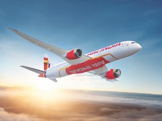
air-india-new-livery-1.jpg

The airline has 470 new aircraft on order from Airbus and Boeing, including new A350s due to arrive from December 2023. It's also upgrading its existing fleet with new seats, new IFE and wifi.

That's in addition to a new customer contact centre, new website/app, new lounges in DEL and JFK and a "cultural transformation".

All of this seems quite positive. Could Air India really be improving?
 
The most exciting bit of the presser was the OMAAT-flagged use of F-UBAI as the rego code for the fake aircraft used to show the livery. Whether intentional or not (highly doubt it), surely Air India would still be hard pressed to compete with the ME3 on one side (plus Riyadh air coming soon), and the other Asian carriers in delivering a competitive long-haul product.
 
It'll take a long time for the Air India stigma to go away and a fresh coat of paint and it shouldn't come as a surprise that management think a new logo and a coat of paint will dramatically change everything.

But if it does pay off, my question will be, what presence will OneWorld want to have in that part of the region? Sri Lankan Airlines wont be given the opportunity to compete in India.
 
The new cabins have been revealed as well, and it looks like they're going with the Safran Unity seat in both F and J (same as QF A35K J), as well as an all new PE, which looks very stock standard. Y on the 777 is going to 3-4-3. Overall, I'd 100% fly them in J, especially if they're undercutting the competition, but F looks like a complete waste of time (why not go with J+?)
 
But if it does pay off, my question will be, what presence will OneWorld want to have in that part of the region? Sri Lankan Airlines wont be given the opportunity to compete in India.
Well, OW did pin IT’s hopes on King Fisher but that turned to sh$t before they even joined….
 
Having been a customer of Air India for the best part of 50 years I’m sad to see the old livery go.

It was iconic.

Airlines moving to an all white background with a splash of colour on the tail and logo is… boring?

I can honestly say I have never been disappointed in an Air India experience. Not saying my expectations have ever been high. But they have always delivered the basics.
Haven’t flown them much long haul but wasn’t overly impressed with them and have never given them another go but perhaps I will in the future.
The main thing I want in J is a comfortable seat that turns into a comfortable bed. A decent selection of F&B and of decent quality is nice and although not a necessity I do like WiFi being a sports addict.
A non negotiable for me though is cleanliness, I can’t stand grotty aircraft with stains on seats, sticky stuff on the screen etc which I found on both my recent AI flights
 
A non negotiable for me though is cleanliness, I can’t stand grotty aircraft with stains on seats, sticky stuff on the screen etc which I found on both my recent AI flights

100%, and have had the same experience. You can introduce the best hard and deliver the best soft product in the industry, but if you can't clean and maintain the hard product, it doesn't matter, and the hard product will start to look bad fast. This has always been an issue for me on my AI flights, so I hope management intends to ensure ongoing investment and improvement in this area.
 
Airlines moving to an all white background with a splash of colour on the tail and logo is… boring?
Cheap to paint - mostly 1 colour
Good for the real aircraft owners (lessor - banks). Does not take much $$ to re flag for the next airline. Removing old paint is the hard part.
[ask QF about a 2nd hand B747]
 
The Frequent Flyer Concierge team takes the hard work out of finding reward seat availability. Using their expert knowledge and specialised tools, they'll help you book a great trip that maximises the value for your points.

AFF Supporters can remove this and all advertisements

If anyone can turn them around it's the Tata.

But if Tata fails, then there is no hope

Taking back what was originally theirs.

Private operators tend to do fairly well in India - anyone remember how good Jet Airways were? or Kingfisher even?

But I think Air India has way too much baggage. Anything other than a completely clean start (maybe this is the strategy in stages?) will still have the old stench.
 
Admittedly I also don’t know enough about the politics of Indian aviation to know to what effect the public ownership of AI may have made it harder and less fair for private competitors to operate, so the status quo will definitely be different — notwithstanding an arguably lacklustre rebranding.
 
Having been a customer of Air India for the best part of 50 years I’m sad to see the old livery go.

It was iconic.
This ... the Maharaja is iconic of the airline and to a certain extent, India. Regardless of where one is in the world, when one sees the Maharaja, you instantly recognize the brand and the warmth etc ... too bad the new logo/design is very *abstract* ...

Growing up, I also like the *dhruv* logi - basically a man with a bow & arrow - that was a good logo as well, however, it was in use when I was a kid, so I don't associate it more with AI than the Maharaja ...

Airlines moving to an all white background with a splash of colour on the tail and logo is… boring?
More than boring - the current color scheme selected gives a sense of *modernity without substance* OR *being overly simple, simply to prove a point of being simple*- at least to me. Someone else might get a different sense.
 
More than boring - the current color scheme selected gives a sense of *modernity without substance* OR *being overly simple, simply to prove a point of being simple*- at least to me. Someone else might get a different sense.

It just needs to be rebranded to Air Indialy like so many hi-tech names for apps these days.
 

Enhance your AFF viewing experience!!

From just $6 we'll remove all advertisements so that you can enjoy a cleaner and uninterupted viewing experience.

And you'll be supporting us so that we can continue to provide this valuable resource :)


Sample AFF with no advertisements? More..
Back
Top