Feedback on the AFF website & brand refresh

No. I just bookmark “what’s new" hence my not being worried about the changes cause I hardly see any of it. Plus I am still on the old style.

View attachment 463252

Same - except I have two tabs on my browser next to each other: one for 'New posts' (ie. what I'm already following) and the other for 'What's new'.

I check the first one regularly; the other periodically.
 
To the design team - the favicon hasn't updated to the new logo? Or do I just have to refresh my browser cache?
Thanks for mentioning. I’ve been in all-day workshops the last couple of days so didn’t get to screenshotting this and posting. Not sure if the team has changed things since your post, but I’m currently seeing the updated favicon.
 
For those who may have reverted to the Classic theme, you won't have noticed yet - but we've shifted the headers on the forum to the suggested purple from @DejaBrew's feedback - a great call :)
Cheers! I might be a tad biased - and I know the change is not going to satisfy everyone - but I honestly do think that's a significant improvement to the new theme. 👍
 
A couple of other things I've spotted since the Forum was updated...

First, the label for "conversations" should have a capital "C".
1754612197101.png
Second, take a look at the menu bar...
1754612550869.png
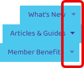
Now, as I we gradually hover over the "What's New", "Articles & Guides" and "Member Benefits" menu headers, what do you notice?

1754612620908.png
1754612627120.png
1754612632774.png
For those playing at home, the answer is that the little down arrow head on the "Articles & Guides" menu is a different colour (i.e. See here) to that of the "What's New" and "Member Benefits" menus (i.e. See here).
1754613581488.png
I might have considered to this to have been by design, except for the fact that when you hover over the down arrow head on either the "What's New" or "Member Benefits" menus, they change colour to match up with the "Articles & Guides" menu.
1754613632139.png
1754613639830.png

Note: Both of the items I've flagged here are consistent across all themes and are not specific to the new AFF Theme. In the case of the down arrows on the menu bar, the colours in question are obviously going to vary depending on the selected theme, however the colour discrepancy on menu hover is consistent.
 

Attachments

  • 1754613264256.png
    1754613264256.png
    19.2 KB · Views: 0
  • 1754613250302.png
    1754613250302.png
    18.9 KB · Views: 0
Last edited:
Read our AFF credit card guides and start earning more points now.

AFF Supporters can remove this and all advertisements

Another suggestion for your main site...

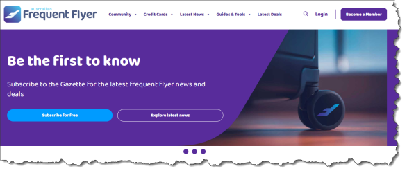
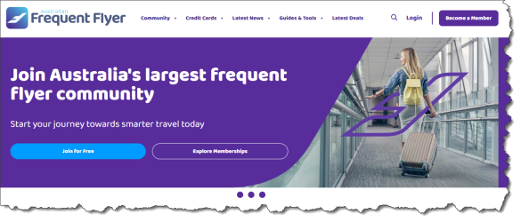
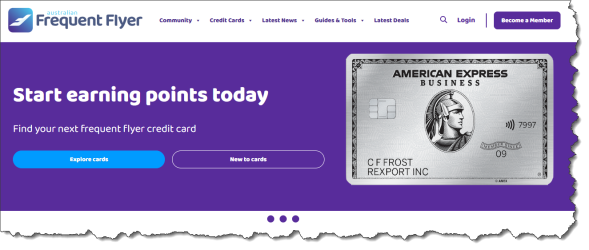
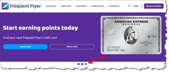
The carousel on the homepage has 3 slides -:

1754653541766.png
1754653552848.png
1754653558439.png
Problem is, as a visitor to your site, I have no visual indicator as to which carousel slide I'm currently seeing? This is because the 3 pips underneath the slide all share the same colour, regardless of which slide is currently displayed -:

1754653696425.png
To simplify navigation, the pip associated with the "active" slide should be highlighted in a different colour, e.g.

1754653832136.png
 
Allow me to apologise in advance for this first item as it's going to sound like I'm picking on the new logo again, but here goes....

The website is known as "The Australian Frequent Flyer" / "Australian Frequent Flyer". This - or "AFF" - is what's commonly written, communicated and understood by all who use the site and services. Your outgoing logo was branded as "Australian Frequent Flyer", but whether by creative design decision or inadvertent oversight, the new logo brands the site as "australian Frequent Flyer" which appears at odds with every other mention of the site name.

1754738539922.png
1754738551564.png

From a brand styling perspective, unless this lowercase styling is an intentional and well-documented part of the brand's visual identity or there's a consistent and strategic rationale behind it, it's generally not the done thing.

For what it's worth, given there are plenty of companies that use lower casing in their logos/brands (and so as to get a second opinion of sorts), I queried ChatGPT on the topic. Here's what it had to say -:

Logos are often stylized with typographic choices that ignore traditional capitalization (e.g. "facebook", "intel", "adidas"). However, those companies have intentionally developed their visual identities around that lowercase styling and have rigorous brand guidelines explaining it. Simply lowercasing part of the name without that established context weakens the brand and may confuse the audience.

Obviously ChatGPT is not going to be the absolute authority on the matter, but it's worth looking at some of those examples to see how they use their brand name in other contexts beyond simply the logo.
 
I'm not paid to say this :) (promise) but I simply cannot see that. For me, its the same FF site, with all the tips and lessons from experts and each other, Matt's editorial pieces, the Gazette, webinars, podcasts. I never see credit card stuff. OK - I just went 'Home' which I never ordinarily do. There's a cc ad and two areas that look into ccs, amongst about 6 or 8. Zero diff from any other similar site you'd go to. Occasionally I see stuff by Chris Chamberlin, but other than that Point Hacks is invisible to me. Having said that, its obvious that PH need income (not least to pay for the AFF side of things!) - its a commercial operation, just like AFF was under Clifford.

I think the re-brand is poor, but again, on the forum pages its less of an assault (and thanks to @DejaBrew at least, I dare say the faults will be ironed out), so I'm continuing the old style that I've used since the last site 'refresh' - which I recall got the same shock, horror, but we all adapted. Remember when they did away with the app :eek: ?
I liked having the app and still miss it.
 
Allow me to apologise in advance for this first item as it's going to sound like I'm picking on the new logo again, but here goes....

The website is known as "The Australian Frequent Flyer" / "Australian Frequent Flyer". This - or "AFF" - is what's commonly written, communicated and understood by all who use the site and services. Your outgoing logo was branded as "Australian Frequent Flyer", but whether by creative design decision or inadvertent oversight, the new logo brands the site as "australian Frequent Flyer" which appears at odds with every other mention of the site name.

View attachment 463693
View attachment 463694

From a brand styling perspective, unless this lowercase styling is an intentional and well-documented part of the brand's visual identity or there's a consistent and strategic rationale behind it, it's generally not the done thing.

For what it's worth, given there are plenty of companies that use lower casing in their logos/brands (and so as to get a second opinion of sorts), I queried ChatGPT on the topic. Here's what it had to say -:


Obviously ChatGPT is not going to be the absolute authority on the matter, but it's worth looking at some of those examples to see how they use their brand name in other contexts beyond simply the logo.

Maybe this is the precursor to defocusing the site on Aussie travellers and trying to garner more (clicks) revenue from overseas 🤷‍♂️
 

Become an AFF member!

Join Australian Frequent Flyer (AFF) for free and unlock insider tips, exclusive deals, and global meetups with 65,000+ frequent flyers.

AFF members can also access our Frequent Flyer Training courses, and upgrade to Fast-track your way to expert traveller status and unlock even more exclusive discounts!

AFF forum abbreviations

Wondering about Y, J or any of the other abbreviations used on our forum?

Check out our guide to common AFF acronyms & abbreviations.
Back
Top