- Joined
- Aug 21, 2011
- Posts
- 16,717
- Qantas
- Platinum
- Virgin
- Platinum
- Star Alliance
- Gold
The boarding passes of most airlines look reasonably good and, at a minimum, convey the most important information (flight number, gate, boarding time, etc.) in a way that's easy to read.
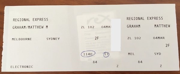
So I was surprised when flying Rex in business class last week how bad the boarding pass looked. It was printed on receipt paper, had no airline branding, did not mention the class of travel anywhere and I imagine most people wouldn't have found it very useful at all. (At least the check-in agent circled the boarding time!)
It reminded me a little of the LATAM boarding passes in Brazil which are printed on flimsy yellow receipt paper - although, at least those boarding passes contain all the relevant information and are easy enough to read.
At the other end of the spectrum, mind you, some of the US airlines (e.g. American Airlines) have way too much information (not to mention, the TSA agents also scribble all over them).
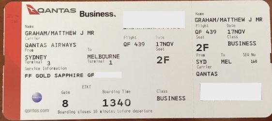
Compare this to a Qantas boarding pass, which is easy to read, has clear branding and looks nice.
Maybe most flyers don't really care what their boarding pass looks like, but at a minimum, surely they should be easy to read. So why don't some airlines make the effort - is it just expensive, is it laziness, or something else?
So I was surprised when flying Rex in business class last week how bad the boarding pass looked. It was printed on receipt paper, had no airline branding, did not mention the class of travel anywhere and I imagine most people wouldn't have found it very useful at all. (At least the check-in agent circled the boarding time!)

It reminded me a little of the LATAM boarding passes in Brazil which are printed on flimsy yellow receipt paper - although, at least those boarding passes contain all the relevant information and are easy enough to read.
At the other end of the spectrum, mind you, some of the US airlines (e.g. American Airlines) have way too much information (not to mention, the TSA agents also scribble all over them).
Compare this to a Qantas boarding pass, which is easy to read, has clear branding and looks nice.

Maybe most flyers don't really care what their boarding pass looks like, but at a minimum, surely they should be easy to read. So why don't some airlines make the effort - is it just expensive, is it laziness, or something else?
Last edited:


