Changes to AFF home page

Status
Not open for further replies.

Lynda2475

Senior Member
Joined
May 1, 2009
Posts
8,617
Qantas
Platinum
Virgin
Red
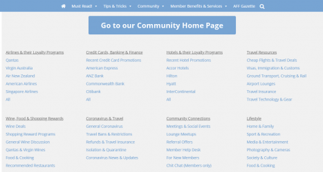
Ive noticed over past couple of days that if I want to get to the forums from the AFF home page, it now takes 2 clicks instead of the 1 it used to take.

Im finding it annoying, that a pull down menu appears (see below) with a button instead of going straight to the Forums home page, especially when on my tablet, as it is really hard to click the new button on the tablet.

1609199526585.png
 
Ive noticed over past couple of days that if I want to get to the forums from the AFF home page, it now takes 2 clicks instead of the 1 it used to take.

Im finding it annoying, that a pull down menu appears (see below) with a button instead of going straight to the Forums home page, especially when on my tablet, as it is really hard to click the new button on the tablet.

View attachment 236854
Completely agree. Extremely painful on a mobile too. I'm not too sure why they don't keep the menu formatting/links the same across the Home page and the Forums page.
 
It's always flummoxed me why the log in button isn't on the home page. No doubt there's some technical reason I'm unaware of. But it now takes me 3 pages before I get to log in.
 
The Frequent Flyer Concierge team takes the hard work out of finding reward seat availability. Using their expert knowledge and specialised tools, they'll help you book a great trip that maximises the value for your points.

AFF Supporters can remove this and all advertisements

I'm not too sure why they don't keep the menu formatting/links the same across the Home page and the Forums page.
Because they are two entirely different software products they link to different things. For the most part, the top menu bar looks the same, with a few changes that take into account where you are. If on the home page there are going to be more links to articles that have been written in the past or are new. If in the forums there are going to be more links to watched threads, member lists and new posts.
It's always flummoxed me why the log in button isn't on the home page. No doubt there's some technical reason I'm unaware of. But it now takes me 3 pages before I get to log in.
The home page – as you put it – is a Wordpress product that allows us to write news articles. Meanwhile, the community forums are a Xenforo product that allow you to create posts. While Xenforo allows for some article writing, it is no where near as polished as Wordpress, and while Wordpress can offer community forums, they're no where near as polished as Xenforo. For this reason, we use the right software for the right task.

As they are two separate products, a log in button at the top of the home page would take you to the backend of this system, where we write articles.

Your best bet is to save a bookmark for the forum separately to the home page articles. I have several more than this even, allowing me to get right to the point I wish to start at, as typing out web addresses, especially when they're as long as ours, can get tiresome.

www.australianfrequentflyer.com.au – home page

www.australianfrequentflyer.com.au/community – forum
 
Because they are two entirely different software products they link to different things. For the most part, the top menu bar looks the same, with a few changes that take into account where you are. If on the home page there are going to be more links to articles that have been written in the past or are new. If in the forums there are going to be more links to watched threads, member lists and new posts.
That still doesn't answer why I can't click 'Community' on the home page and be taken directly to the forums. Why introduce an additional click? I imagine an overwhelming majority of time is spent on the forums as opposed to articles. It's poor design to require two clicks to access the (arguably?) main function of the site.
 
Appreciate the response but since they have always been different products, why the sudden change to the home page to introduce extra clicks to get to the community forums?

It was better last week before this latest change, and surely a simple url link is supported by both products.
 
Appreciate the response but since they have always been different products, why the sudden change to the home page to introduce extra clicks to get to the community forums?

It was better last week before this latest change, and surely a simple url link is supported by both products.
I was not in charge of the re-design to the home page, but I know that it was worked on for a long time and was a complex project with many moving parts. I also don't regularly visit the home page 😳 as my main focus area is the AFF Community Forums (like many others) and Frequent Flyer Solutions, though I do recognise that many get their news from the home page before moving onwards.

I do not know how you have your iPad set, for example if you type the URL each time or if you click a saved bookmark that heads to the home page, but a second saved bookmark would provide a quick remedy to this in the short term.

Ultimately, my hands are tied in the sense that I can pass feedback along and I can try explain how things work or what the reasoning for a change was, but I can't just edit the theme. I think if I tried I'd break the whole front page as it is not my area of expertise.

Having now seen how the new dropdown menu works, I can understand what was aiming to be achieved. It provides a good overview of common forums and allows you to easily enter them, bypassing the community forums list of all the forums. I believe this is why many members actually save a bookmark to New Posts on their computers instead. I do not, but I realise everyone accesses the forums differently.
 
The following is my personal opinion and unrelated to my position as a moderator.

By having the dropdown there is an instant viewing of all the relevant forums that are available which also serves as an alternate way to step into any topic/area. In many ways this is easier for a new member to find what is available for them to peruse. The system needs to be setup for all levels of user. I can't comment on the use of an iPad as I don't use one for AFF.

As an experienced user there are ways to shortcut the extra click. e.g. have a bookmark that opens to any specific page.

Re the comment about shutting down the thread and thus conversation: AFF has always had a ‘moderation in moderation’ policy. This has only changed recently when people have started being aggressive and attacking each other and discussing politics. There is and never has been tolerance for any of these. Having said that there has always been a policy of no public discussion of moderation. If people have an issue with things, then feel free to message a moderator, admin, or support. It will be discussed by the mod team and you will get an answer as soon as is reasonable. More difficult issues can take a little time as they are saved for a meeting.

I hope that explains your queries to some degree. If someone wants, then please feel free to message me though I probably won’t answer today as I’ll be travelling most of the day. (by car)
Good on you @straitman for providing a reasoned and considered response!
 
FYi i dont use an ipad or any apple products, I use a android tablet and an android phone.

It is apparent the changes were not tested on mobile version of the site (using chrome), as its flakely, hard to keep the preview up long enough to click on the button or any link.

IMO the new overview provided is exactly the same detail already available on the forum home page, it actually makes it harder to navigate on mobile devices.

Forcing me to bookmark the forum page, just ensure I will no longer read any of the articles, as I wont see them, whereas usually, I take a quick look at the headline and a single click to get to the action of the forums.

I think if a poll was run, most (especially those not using a laptop/desktop) would prefer the old single click option be reinstated.

But Im glad at least one person sees a benefit
 
FYi i dont use an ipad or any apple products, I use a android tablet and an android phone.
Apologies, I got yours and another reply mixed up. But all tablets and all phones should function the same.
It is apparent the changes were not tested on mobile version of the site (using chrome), as its flakely, hard to keep the preview up long enough to click on the button or any link.
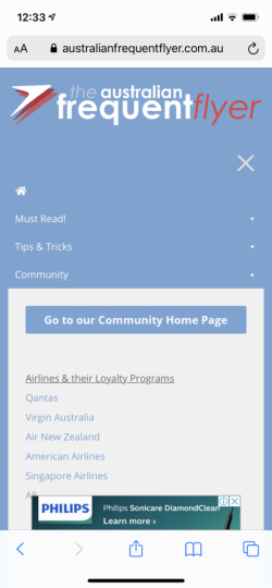
I have tested this on my mobile (I don’t have a tablet) and experience no lag. The dropdown menu appears to stay open indefinitely, allowing for easy clicking, but it comes from a ‘hamburger’ menu instead of the same style as a desktop.

Perhaps you have your browser set to always load the site as if you were on a desktop and this is fooling the page into loading elements that are harder to use on a mobile device? I’m not sure if this is accurate or not, but my limited tests show it’s very easy to use in portrait. What I see below.

E346016B-5750-412C-A408-CF4453EB99D7.png
 
Good on you @straitman for providing a reasoned and considered response!
Thanks.

In addition I have just discovered that on a laptop you still only need to click once. Hovering the pointer over the the word Community on the home page is all that's needed. Then move it down to the 'Go to our Community Home Page' is the only click needed. I hope that makes sense and also makes it a little easier.

I'll try it on my iPad when I have an opportunity.
 
Thanks.

In addition I have just discovered that on a laptop you still only need to click once. Hovering the pointer over the the word Community on the home page is all that's needed. Then move it down to the 'Go to our Community Home Page' is the only click needed. I hope that makes sense and also makes it a little easier.
This is a good point, but it is still nonetheless an extra action.

Previously you simply had to click Community. Now you have to hover over Community and then click Go to our Community Home Page.
 
I’m not sure if this is accurate or not, but my limited tests show it’s very easy to use in portrait.
I've had a few occasions now where switching to landscape orientation on my phone shows the top menu bar instead of the hamburger style on the right. In portrait orientation it always shows the hamburger style.

Due to the size of the dropdown from the menu bar I can see how this would be an issue on a phone in landscape orientation – as it takes up the rest of the screen – however, clicking on community did not leave the preview up for a finite period of time. Instead, it stayed accessible, even if I scrolled around the page. Pinch to zoom got rid of it though.

Can you confirm @Lynda2475 if you see the hamburger menu at all on your mobile?


IMG_0480-2.png
 
Yes I seethe hamburger on the phone, but still 2 clicks to get to forum vs one previously.

Mostly i read on my tablet (in landscape not portrait) and it normally shows desktop site version without issue until this change which doesnt seem to render i.e. the pull down doesnt like to stay visible long enough to select the button. I dont see the hamburger on tablet (even in portrait mode).

As there doesnt seem to be anyway to have bookmark bar visible on the tablet version of chrome (despite what google says) so even if i bookmark the direct forum link im doomed to mutliple clicks to get where i want to be.
 
Thanks for the feedback. I have now made a (minor) adjustment so that the word "Community" in the menu is clickable - if you simply click on the word you will be directed to the community home page. Hope this solves the issue some of you are experiencing.
 
Thanks Admin, that is awesome and works perfectly on all devices, Im happy now :)
 
Status
Not open for further replies.

Enhance your AFF viewing experience!!

From just $6 we'll remove all advertisements so that you can enjoy a cleaner and uninterupted viewing experience.

And you'll be supporting us so that we can continue to provide this valuable resource :)


Sample AFF with no advertisements? More..
Back
Top