Revised Qantas FF Account Home Page June 2019

Status
Not open for further replies.

serfty

Veteran Member
Moderator
Joined
Nov 16, 2004
Posts
46,549
Qantas
Platinum
Virgin
Platinum
Revised content - with left side menu. More information upfront and less white space.

Here is the status showng at the top left of the account information display - it's showing me as Life Time Gold rather than Platinum though :(

168119
 
Last edited:
Like putting lipstick on a pig.

There's no point improving the aesthetics of a web page if all of the content is wrong. The FF page frequently throws up an error when I seek to view my upcoming bookings. Been doing it on and off for months now. Tried different browsers and different computers. Useless.
 
I can't detect any difference, using Chrome. But at least I can log in now. Couldn't for several days last week. :rolleyes:

Agree completely with @levelnine .
 
No change to the site appearance on my end.
 
No difference here. Tried an incognito window in case it was a caching thing, also no difference.

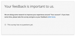
I did get a prompted to 'provide feedback on My Account' which directed to a Hotjar survey page which had no questions..

168143

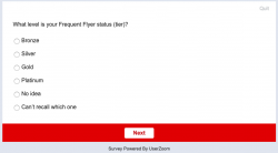
It wasn't immediately clear that I had to "click here" to end up at a survey delivered through another platform entirely (Userzoom?)

First question didn't list all the QFF membership levels... I gave up

168144
 
Here is a modified version of what I see. The next booking used to be on the left, not in the middle. The series of options such as "profile" used to be on the right.

Maybe it's because I am with Qantas Business Rewards ...

168146
 
The Frequent Flyer Concierge team takes the hard work out of finding reward seat availability. Using their expert knowledge and specialised tools, they'll help you book a great trip that maximises the value for your points.

AFF Supporters can remove this and all advertisements

The last time they made changes like this it was a rolling implementation somehow so took time for everyone to get it.. so not too surprised that some are seeing the old version still. Mine is still old version indeed.

The new format looks nicer to get the important stuff up front though (nice editing :) )

I will say this.. still a choice to not show points expiry which is pretty bad in my view.
 
No change for me, but in an app update from earlier this year, it now shows P1 and LTG when you view your digital membership card.

How do you do a "scroll down" screenshot of the whole page?
 
No change for me, but in an app update from earlier this year, it now shows P1 and LTG when you view your digital membership card.

How do you do a "scroll down" screenshot of the whole page?

Google Chrome has an extension called Full Page Screen Capture that you can find in their extensions directory.
 
How do you do a "scroll down" screenshot of the whole page?
The snip I posted isn't a whole page - there is more bandwidth hogging junk to the south that is not shown.

To do it, I did an F11 (view whole screen), then <CTRL+<minus>> until it fit, then did a screen capture.
 
Just logged into qantas.com this morning and was greeted with a new-look website.... seems like it was designed by 20yo interns with a focus on high-resolution images over functionality. Takes sooooooooo long to load and responds like a dog.... the lag when scrolling down the screen is terrible. And I am on good internet (probably the best - corporate intranet of a certain major Telco). Am I the only one who wants function over form???
 
Yep - I was a guinea pig for this a bit over two weeks ago.

 
If I want to make full use of my QFF membership, I had better start rationing my super.

Expiry date now set to 2101 ;)
 
Status
Not open for further replies.

Enhance your AFF viewing experience!!

From just $6 we'll remove all advertisements so that you can enjoy a cleaner and uninterupted viewing experience.

And you'll be supporting us so that we can continue to provide this valuable resource :)


Sample AFF with no advertisements? More..
Back
Top